It’s that time of career again.. I think I’ll ditch the traditional format and go infographic this time, and what a timely Cool Infographics post! I’m keen on cartographic visuals, like this not-quite-but-somewhere-along-the-lines resume by Jordan Carroll:

Work
ringing in 2010
On a personal level, it was a great decade, a time of many landmark events that changed the course of my life and thoughts. I made my biggest mistake, I bought that one-way ticket to Thailand, and I married the kindest, most generous man in the world. Some of the best conversations in my life happened in this decade, and I met incredible people breaking new paths I’d never considered possible.
Externally, it was also the crummiest decade and I join the chorus of those glad to leave it behind. On the cusp of tectonic changes in the course of political ideologies and the fate of humanity, I’m glad to have experienced it from this Asian side of the rock.
I have no resolutions, just a few long-term objectives that don’t break easily into annual stepwise goals. To everyone I love and those who touched my life: My best wishes to you for good food, great sex and brilliant conversations in the new year ;-)
Anyway, less from me and more from an eloquent commencement speech given by Paul Hawken for the graduating class of 2009 in University of Portland. He captures quite well an excellent view forward.
When I was invited to give this speech, I was asked if I could give a simple short talk that was “direct, naked, taut, honest, passionate, lean, shivering, startling, and graceful.” No pressure there.
Let’s begin with the startling part. Class of 2009: you are going to have to figure out what it means to be a human being on earth at a time when every living system is declining, and the rate of decline is accelerating. Kind of a mind-boggling situation… but not one peer-reviewed paper published in the last thirty years can refute that statement. Basically, civilization needs a new operating system, you are the programmers, and we need it within a few decades.
“YOU ARE BRILLIANT, AND THE EARTH IS HIRING.”
This planet came with a set of instructions, but we seem to have misplaced them. Important rules like don’t poison the water, soil, or air, don’t let the earth get overcrowded, and don’t touch the thermostat have been broken. Buckminster Fuller said that spaceship earth was so ingeniously designed that no one has a clue that we are on one, flying through the universe at a million miles per hour, with no need for seatbelts, lots of room in coach, and really good food—but all that is changing.
There is invisible writing on the back of the diploma you will receive, and in case you didn’t bring lemon juice to decode it, I can tell you what it says: You are Brilliant, and the Earth is Hiring. [Read more…] about ringing in 2010
Rave: research tool Zotero
In writing my report (effect of purchasing on quality of health service delivery in Kampot, Cambodia), I came across a useful tool I just have to rave about: Zotero. It’s a citation manager that works out of your Firefox browser which stores, retrieves, organizes, and annotates digital documents. Here’s a list of its main utilities, by Efficient Academic:
- Automatic capture of citation information from web pages
- Flexible notetaking with autosave
- Playlist-like library organization, including saved searches (smart collections) and tags
- Runs right in your web browser
- Storage of PDFs, files, images, links, and whole web pages
- Fast, as-you-type search through your materials
- Platform for new forms of digital research that can be extended with other web tools and services
- Formatted citation export (style list to grow rapidly)
- Free and open source
Zotero integrates seamlessly into MS Word and Open Office (which I now use). Its biggest limitation seems to be, by comments on The Ideophone’s review, is:
…Compared to Endnote (which is proprietary), Zotero is light on citation styles currently. I expect this to change while Zotero builds up a userbase and a community (people will start contributing styles).
Although, at the time of writing, Mark at Ideophone writes that Zotero now supports hundreds of citation styles, with several being added each week; see http://zotero.org/styles/.
And the learning curve is fairly easy, which is good for not-so tech-savvy users (like me) who need a quick way to organise literature searches. A myriad of tutorials are available online, hundreds on YouTube alone.
Faces
logo redesign
The new and much improved logo for NIPH (National Institute for Public Health):
It’s a vast improvement over the old one, which I cannot find a trace of anywhere now to take a good photo of it (I’d burn all instances of it too if I were the director!): 
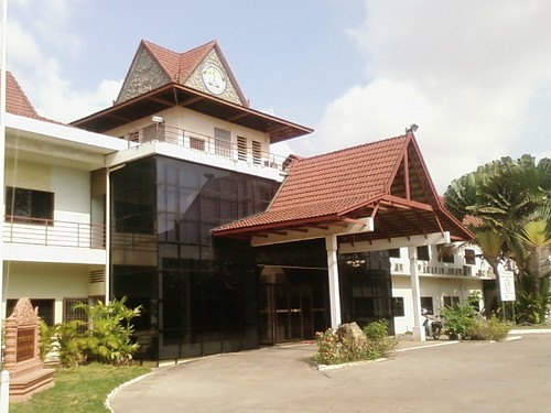
This is the main building in the NIPH compound. I can’t tell you how happy I am not to have to see that silly-looking smiley face logo whenever I walked into the office!
The German-Cambodian Technical Cooperation supported the NIPH since 1996 and now it’s aiming for accreditation as a higher learning institution. It’s a long process, so for now NIPH is seeking accreditation to national standards (these criteria not yet defined in Cambodia), then down the road (way down the road) is international accreditation.
on presentations…
This graphic on the US trade surplus/deficits at Visual Ephiphanies is quite cool. I love how large a amount of data is captured in a single image.
It reminded me of the bane of our work here– ineffective presentations (…of which I’m guilty of occasionally as well!). Speakers’ points are buried so deep in useless images, graphics and meandering bullet points that oftentimes at the end victi– err, participants— spend the precious little time allotted to questions trying to hash out exactly what the point is rather than actually brainstorming solutions. Imagine our conferences with back-to-back powerpoint presentations and simultaneous translations to French and English…
The above statistician is an advocate for effective data visualisation, much like Edward Tufte. I was introduced to the Tufte principles for data visualisation a couple of years ago (by Leslie? Bill?). He’s a passionate champion for good information design for practical, actionable presentations. One of his more famous examples is the Shuttle Columbia disaster, where crucial information was presented ineffectually, leading to a disastrous management decision.
Barring needing to graphically depict large amounts of data competently, his tips are useful at any level of data / message complexity, even for tech-unsavvy folks like me! Here are at least some key points I try to stick with for simplifying presentations for effectiveness:
* Frame your presentations: What’s the problem; who cares; and what’s your proposed solution
* When presenting, show up early and finish early
* Don’t use bulletpoints (though I must disagree with this for some of the less-sophisticated audience here)
* 1+1=3… Two elements in close proximity can create a third “ghost image” from the negative space between the two elements
* Put your name on things — it shows you care about the content and take responsibility for its validity
* “It’s better to be approximately right than exactly wrong”
* The resolution of good old paper is higher than the most advanced computer monitors
* Never harm the content — the design should be based on the content, not the other way around
* If a chart, table or object needs a label, do it inline — don’t use legends/keys that require “back-and-forths”
* Don’t use footnotes, use sidenotes — they’ll be closer to the content you’re referencing
* Reduce clutter by clarifying the design and then adding information
* The power of the Smallest Effective Difference — make all visual distinctions as subtle as possible, but still clear and effective
* Good design is clear thinking made visible, bad design is stupidity made visible


